Maybe I’m being cocky, but I think I’ve come a long way since my first food photo with a tiny Canon Ixus 5 point-and-shoot. I LOVE taking photos of food – not just because I’m Asian! – and there is just so much going on behind the scenes when trying to create a beautiful food photo!
It can be hard to know where to start though, and one of my favourite ways to learn about styling, is to study photos that I find beautiful, and copy these techniques in my own photos!
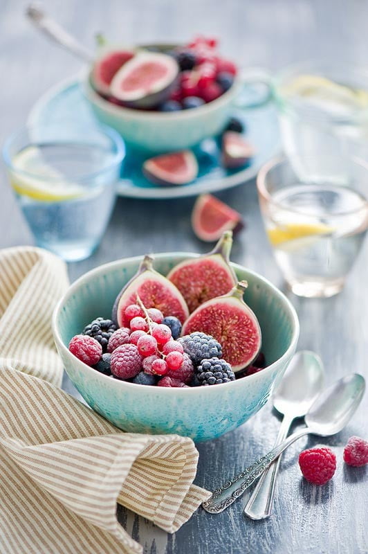
This week, it’s all about this simple but gorgeous photo I found at Cooking Pleasure. It’s essentially a bowl of fruit – nothing too exotic that you can’t find in your local supermarket – but it’s so beautifully styled and photographed that I can’t stop looking at it! Here’s why this photo is this week’s photography inspiration!
Depth of field
A trick to creating a sense of “capturing a moment” is to utilise a shallow depth of field. It helps to draw your focus to the hero in the shot – in this case the bowl of fruit – and creates a sense of stillness. One simple way I like to create depth of field is “something in the front and something in the back”, which is used here by placing more fruit, and glasses of water in the background, and scrunched up linen in the foreground.
Colour palette
Capturing a beautiful photo is a bit like drawing or painting. You need to consider what the colour palette of your picture is going to be, in order to choose props and linen that make sense. Here, there is a calm wash of blue, accented by bright yellows, calling on a sense of summer. Fruit, summer…makes sense right? Even the soft grey of the tabletop helps to set the scene, and it gives the pink, red, and purple fruit plenty of opportunity to pop!
Light
This photo creates a sense of lightness and serenity, and that’s to do with the bright, near-shadowless lighting used. You can see that the bowls are primarily back-lit, and the shadows are filled in by using white boards or fabric to bounce diffused light back onto the food. Alternatively, you can create a dark moody look by using black boards to absorb light and cast more shadows, and completely change the mood and look of the photo!
Texture
Texture adds so much character to an otherwise flat photo, and here is where your choice of props and linen detailing really makes a difference. The little ornate filligree on the handle of the spoons, the grain in the wood on the table, and the kind of fabric used in this photo all work together to bring this to life.
Composition
You can really see a fantastic use of the “rule of thirds” here. Most would place the “hero” bowl of fruit right in the middle of
the photo, but this photo places it on the lower one-third line, leaving plenty of room to create context and mood in the background. The use of the two spoons in the bottom right corner of the photo is also a great bit of detail – it warmly invites the viewer to pick up a spoon and dive right in!
Props
These glazed plates and bowls have a beautiful ombre effect that fades the blue into white with very fine details. The delicate patterning on the side of the bowls are echoed in the handles of the spoons, and create a feminine, homely look in the scene. Small bowls, teacups and glasses allow the stylist to create a sense of fullness and bounty, and to me, just shouts, “SUMMER IS HERE!”
Of course, there are so many more elements to what makes this photo beautiful, and I’d love to hear what you think! Do leave me a comment below, or follow my Pinterest board for my collection of more inspiring food photos!
