Source: Mark Boughton Photography
I’ll admit it. I’ve been guilty of over styling a photograph. SO GUILTY. You know when you keep adding props and textures because you feel like the photo looks a bit empty? Yeah, that.
Well sometimes it’s hard to concentrate on the photography when there are so many elements to consider, so for this week’s Guide to Photography, we are going to take a look at something so simple, the techniques really shine through. Best part is, you probably have the tools on hand to practice it yourself!
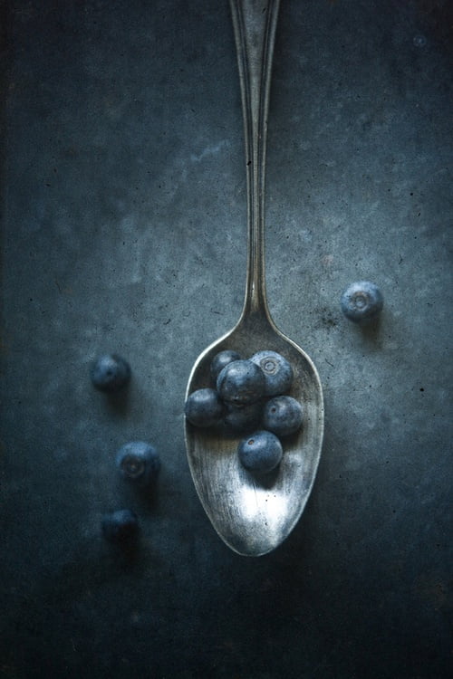
Light Source
There is a very obvious direction that the light is coming from, and in this case, it’s from the top of the photo. It gives the impression that half the photo is in shadow (like the renaissance technique of chiaroscuro) and adds a marvellous sense of drama. The photographer has also added a vignette around the picture, creating a darker mood and a very compelling photo!
Textures
I know technically, everything has a texture. But I’m really enjoying the texture of the spoon and the background in this photo. The aged, vintage look gives that rustic feel, and somehow elevates simple blueberries into “farm-to-table-organic-blueberries”. See, mood really makes all the difference. The stippled colour of the background also reminds me of the way clouds dot the blue sky, and again helps contribute to the rustic feel of the picture.
Colour Palette
There is a very clear colour palette in this picture, and it’s blue. While I love photos that are a riot of colour, so vibrant that they have that toy camera look, I appreciate the simplicity of focussing on a single colour. Many food magazines also employ this method: Donna Hay, for example, often uses palettes of different shades of blue, supposedly because it’s her favourite colour! This helps brings a sense of cohesion to the photograph, and if you use this technique with different coloured foods, it can also help the food pop!
Depth of field
Aerial (top down) shots, usually employs a high F-Stop to ensure that everything is in focus. It’s especially useful when you have, say, a plate of food, and don’t want just the garnish to be in focus. In this case, just the blueberries in the spoon are in focus, drawing the eye to the spoon, and works with the vignette to keep the focus where the photographer wants it.
Negative space
I use negative space nearly enough, and studying photos like these really inspire me to! It not only adds a sense of simplicity, but also allows for enough room if you’d like to, say, add text for a design element! And rooting the spoon where it is also follows the rule of thirds, creating a sense of balance in the photo even though the spoon is off-centre.
Very pretty.
If you’ve read this far, GO YOU!!! You are awesome! Do you like this photo? What do you like about it? Let me know what you think in the comments below!